Still Life
The second brief I was tasked creating three original images using pre-existing objects. These objects must not already belong to you, they can be discovered on the street or countryside, borrowed or traded.
Still Life images can be just about anything that doesn’t move. The definition of a still life subject is an inanimate object but other subjects are loosely termed as still life as well. These include flowers, food, etc. They are life forms but they don’t move.
http://www.schoolofphotography.com/19-still-life-photography/
Carl Kleiner
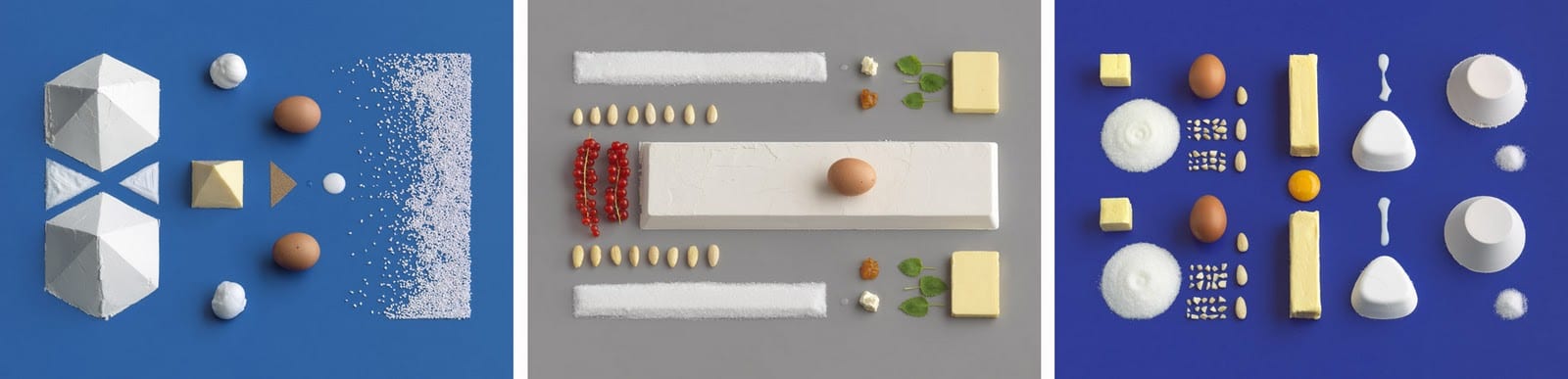
Swedish photographer, Carl Kleiner, is most known for is still life photography. His photography is colourful and experimental and doesn’t limit himself with the choice of objects he uses. A lot of his photography uses geometric shapes that interact with one another in dynamic ways that are aesthetically interesting and pleasing to look at. Some of his most well known images are from an Ikea cookbook called Hembakat är Bäst, in which he photographed the ingredients for the recipes in the exact quantities required. This regimented layout forces the eye to follow the shapes across the page, therefore creating a dynamic image. This is enhanced by the muted backdrops, which instils an almost technological or mathematical feel. In this sense, the work almost reflects a forensic style of photography and focuses primarily on the uses of these, to an unknowing observer, relatively common and mundane substances. This work and its meaning, which could be hidden to an observer viewing the pieces outside of the cookbook context, widens its audience to both those who appreciate the aesthetic and those who enjoy new, innovative ways to compose photographs of images we see a lot in the media (recipes).
However, I am more interesting the work he created using fruit and vegetables to create animals and creatures. This work stood out to me especially as I used to create similar projects when I was younger.
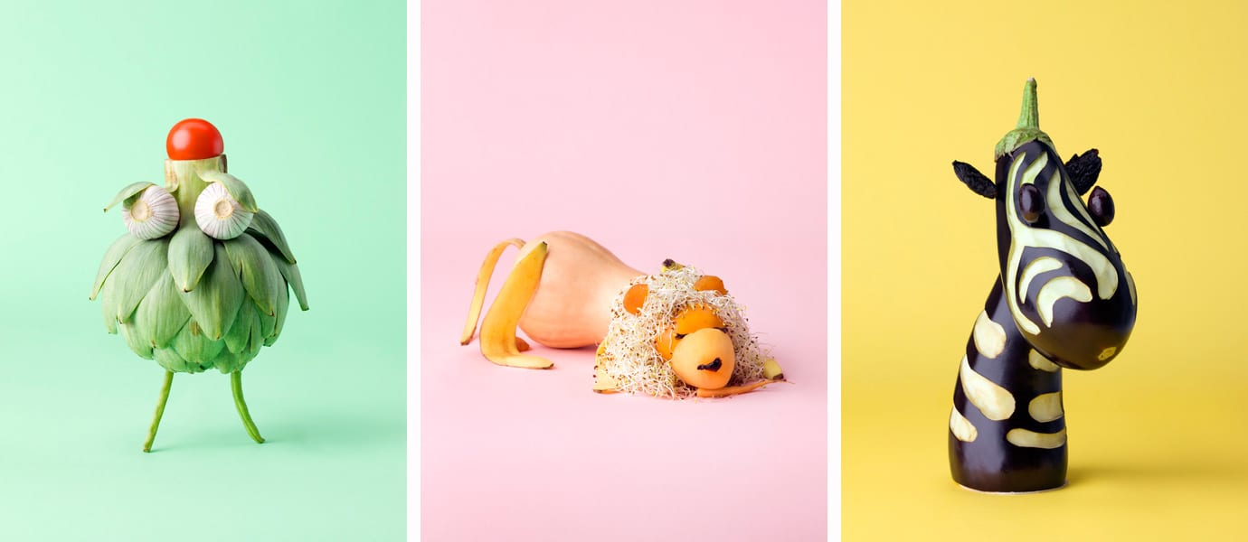
This work explores playfulness in and character in still life, which alongside the pastel backgrounds creates an interesting and exciting composition. Kleiner has a way of giving ordinary objects character and a liveliness in his work, which is something that I aspire to portray in my compositions as it both plays into my love of storytelling and creates visually exciting and fun photography. This has inspired me to attempt to recreate work that I did as a child and explore the idea of ‘play’ in my still life.
Taryn Simon
Multidisciplinary artist, Taryn Simon, created a series of still life photographs guided by an interest in classification, categorisation and the precarious nature of survival.
Contraband (2010) is a collection of 1,075 photographs taken at U.S. Customs and Border Protection Federal Inspection Site and the U.S. Postal Service International Mail Facility at John F. Kennedy International Airport, New York. Simon photographed items detained or seized from passengers and express mail entering the U.S.
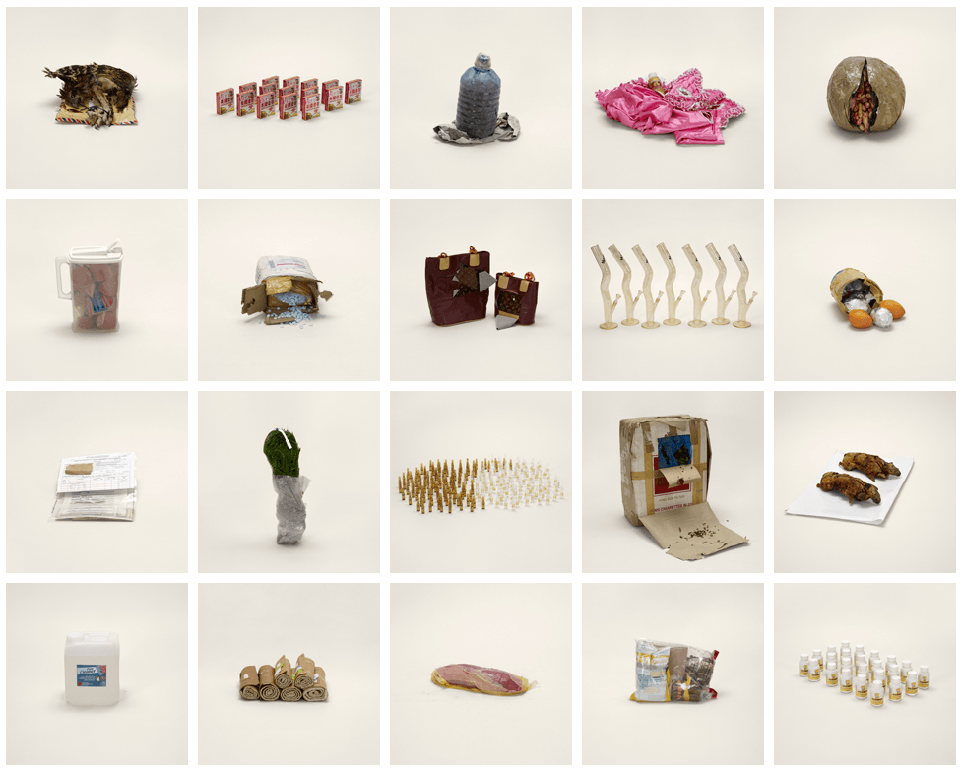
The collection featured objects that we would expect to see being detained as well as somethings we might not and others that were just bizarre. Each of the objects a shot in a studio with flat lighting, which makes us really look at the object and think about its connotations. Also, the objects are all slightly angled to the side, which opens them up and forces us to inspect the. Simon aims to question the idea that some items are ‘illegal’ and others aren’t as well as making us question why. The photography in the collection is simple yet incredibly engaging. The collection doesn’t offer any explanation as to what the objects are or why they were detained, which allows the observer to either take the image as it is or try to investigate further and derive a backstory for the images.
Arthur Woodcroft
Woodcroft has worked professionally as a photographer since 2002 and is mostly known for his commercial work for promotional purposes and companies selling products. This are typically composed in a traditional way that is common viewing within media.
He also has created some still life and more experimental photography. His still life focuses more on the visual as opposed to something with an obvious, deeper meaning and has a clear aesthetic. The colours are chosen specifically to create a contrasting but not obtrusive colourfulness, which when matched with the shapes and elements within the composition makes a vibrant and visually compelling photograph.
My work
The theme of this still life brief was ‘The Found Object’, which meant that I was required to create a triptych composed of objects that I had either found or borrowed from someone else.
I wanted to conceptualise my work so I decided to draw inspiration from the photographers that I had researched. As I mentioned earlier, I really liked how Kleiner and Woodcroft had taken everyday objects and given then life and character through experimenting with ‘play’. This is similar to work that I had done as a child so I was inspired to try and recreate some of my childhood creations and develop them using the skills I have learnt.
Initially, I wanted to recreate the shoebox gardens that I would enter in my local Gardening Show competition each year.
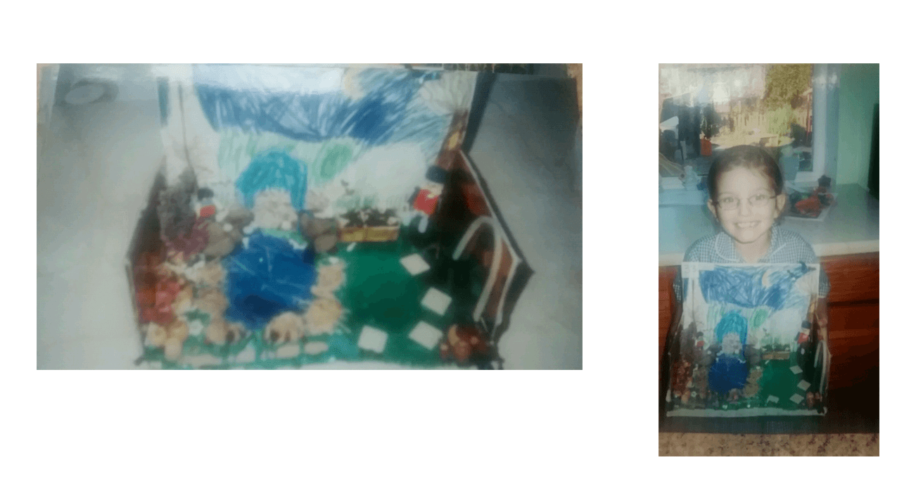
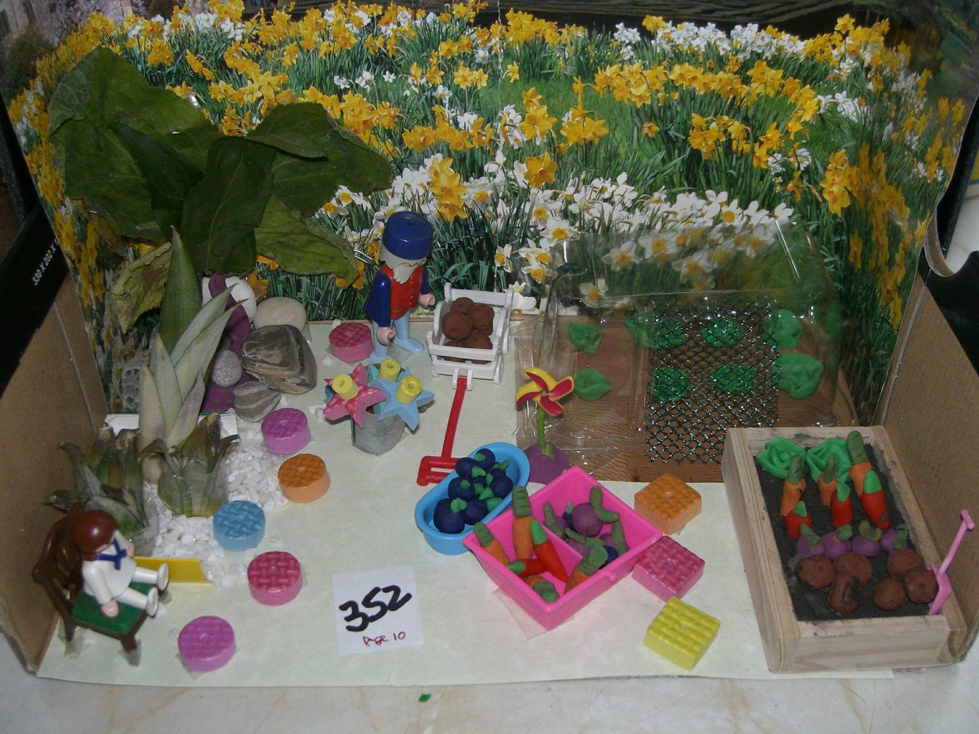
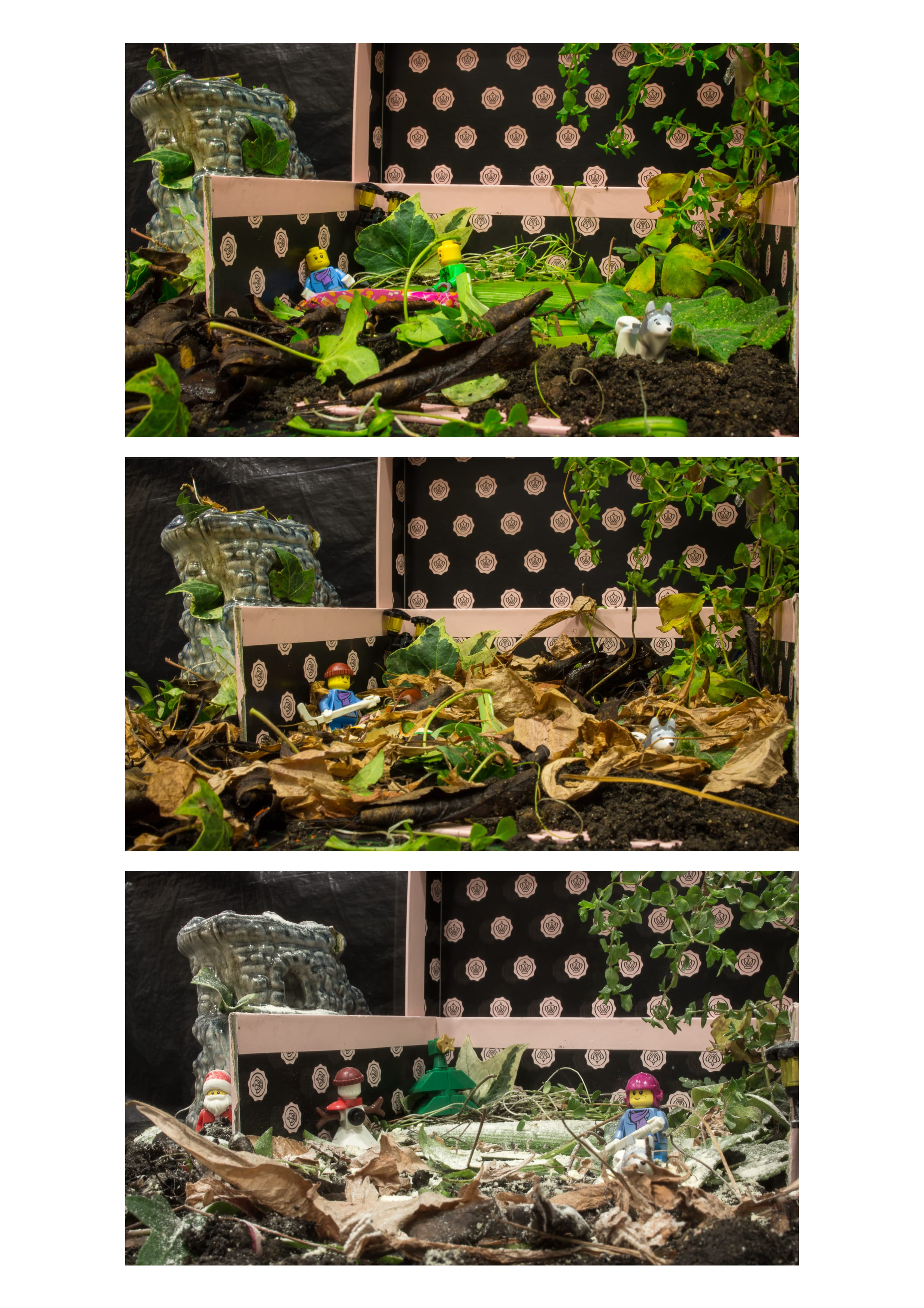
After looking at examples of the gardens that I used to make, I began looking for something to be the main ‘found object’ that could be the focal point of the composition. I found a strange ornament in my garden that looked similar to something you would see in a fish tank. It reminded me of old castle stonework, which I thought would fit in quite nicely with the theme of nature. I also thought it would be interesting to have my triptych represent the seasons so I began collecting soil and leaves from my garden. I decided to use a grated bath bomb as snow and lego figures that my mum had given me to help create scenarios and give the composition more of a story.
However, when I came to photograph my work I found that I didn’t look as I have envisioned. The compositions looked too crowded and I had lost the playful, simplistic charm that made my work as a child be fun to look at. Therefore, I decided to go back my research and rethink what I wanted to create.
I knew that I wanted include nature and that I wanted there to be a juxtaposition between that and my found object. After struggling for a while I was reminded of an ornamental bathtub that my nana has in her bathroom that has always fascinated me for some reason and I thought about some of the work I had looked at in my research. I thought about different ways I could incorporate it into the aesthetic I was going for and experimented with using flowers and soil to create compositions with the bathtub, which actually really liked. I decided that I wanted take everyday household objects and use them as plant pots. I liked this concept as it was a more striped back and minimalistic take on what I had originally wanted to create.
For the second object, I asked my sister if I could borrow her pencil holder; a pastel pink, miniature rubbish bin. I thought it fit my theme quite well and its pastel colour was reminiscent of Kleiner’s food animal work and the colour schemes present throughout Woodcroft’s still life compositions. The third object was a small teacup that I borrowed from my sister-in-law, who loves and collects teacups. It wasn’t an intention of mine to have the objects come from family members but I like the fact that they did as it reminded me of asking people for random objects when making my miniature gardens.
I chose a have pastel backdrops as I felt that they suited the objects and worked well to create an aesthetically pleasing theme throughout my compositions.
I used Lightroom to edit my photos, which allowed me to up the brightness and add more contrast between the colours. I also attempted to sharpen the images as the focus wasn’t as sharp as I would’ve wanted. I adjusted the saturation slightly as I wanted to colours to be vibrant but also still be more of a pastel shade. After fixing the colours in Lightroom I moved onto assembling the triptych and adjusting the framing. The objects were very different sizes, which meant that I needed to move the images around and crop them slightly so that they were all level and centred. I initially wanted the bathtub to be in the centre and then have to two smaller objects either side but I felt like my eyes were solely drawn to that object. I then tried it with the smaller of the three objects and found that this worked better visually as there was an even distribution of space between them.
Reflection
Although I am happy with the concept of my tiptych, I think that the execution could be better. The photos aren’t as sharp as I intented, which distracts the eye and takes away from the stylised, clean look of Kleiner and Woodcroft that I was trying to achieve. I also think that I should have put the objects on a completely flat surface as it would have looked neater and the puckering of the frabric is very noticable. However, I think that in spite of this my concept is strong and actually has some interesting connotations that I hadn’t originally though of. The objects all could be perceived as things that are damaging to the environment and using them as plant pots highlights this as well as having connotations that plants and nature will be around even after we and these objects are gone. This shows that my photogrpahs can read to mean different things by different people and, while not being what I had intented, is quite rewarding.
Leave a comment